
Sketches


The Teaching Artists Residency at Glyndebourne comes with many perks such as the invitation to every opera in the festival run, unrestricted access to much of the beautiful site including the gardens, and up close and personal contact with the performance and staff. Most exciting for me was the opportunity to watch performances during rehearsals. Close details of the sets, conversation between directors, conductors and performers and view of the performers facial expressions are sometimes lost when sat near the back of the auditorium. I was drawn to faces in particular when viewing the rehearsals and therefore sketched many of them on my iPad as you can see above.
Animation


I was fortunate enough to see 7 operas during my residency though one in particular sparked my interest in terms of creating artwork. I felt compelled by the dark and brooding atmosphere of The Wreckers. In the past, my work has explored themes of death, tyranny and community but not for a long while after graduating university and working as an animator on up-beat, vibrant music videos. The Wreckers reminded me of past themes and why I love mystery, uncertainty and darkness.
The darkness of The Wreckers was established through lighting and the use of shadows to cast ominous silhouettes of figures both on the sets and through projections on the backdrops. Using this idea as a starting point, I began sketching scenes which lingered in my memory including the noose falling from the tower, the masks worn by the performers and the movement of the sea from the projections on the backdrop. These stills quickly became animation. Using my iPad I was able to animate frame by frame stills into animation using the same sketchy style as when I drew from the rehearsal.
The darkness of The Wreckers was established through lighting and the use of shadows to cast ominous silhouettes of figures both on the sets and through projections on the backdrops. Using this idea as a starting point, I began sketching scenes which lingered in my memory including the noose falling from the tower, the masks worn by the performers and the movement of the sea from the projections on the backdrop. These stills quickly became animation. Using my iPad I was able to animate frame by frame stills into animation using the same sketchy style as when I drew from the rehearsal.


Watercolour
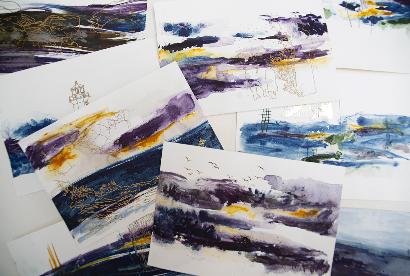
In addition to the animation sketches, I began exploring the use of colour and water to convey atmosphere and texture. For these pieces I used transfer dyes on high GSM paper with the intention to heat transfer them onto fabric. This was unsuccessful but the use of transfer dyes over inks or water resulted in highly pigmented colour and areas of texture where the ink had separated which otherwise would not have been possible with other materials.
Once the pieces were dry, I accented the designs with gold foil. The colours from The Wreckers struck me in it's bleakness coupled with bright, vibrant oranges and yellows from the fires and lighting. I therefore used the sketches from the animation to inspire designs such as lighthouses, characters and birds which I printed on the ink washes and foiled through a laminator so the light would appear to flicker when viewing them, much like the embers of a fire.
Once the pieces were dry, I accented the designs with gold foil. The colours from The Wreckers struck me in it's bleakness coupled with bright, vibrant oranges and yellows from the fires and lighting. I therefore used the sketches from the animation to inspire designs such as lighthouses, characters and birds which I printed on the ink washes and foiled through a laminator so the light would appear to flicker when viewing them, much like the embers of a fire.


Cyanotype
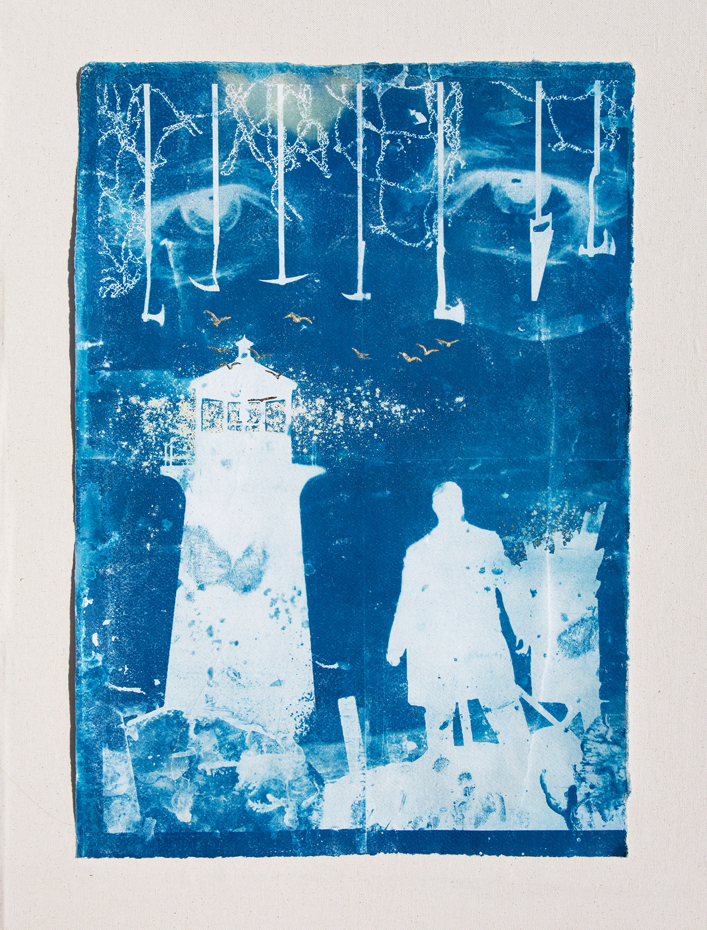
The casting of shapes to suggest underlying tensions came through in my project when I used paper and acetate to cast shadows onto my page. To capture these shadows I used a technique called Cyanotype. This involves a combination of two chemicals; Potassium Ferricyanide and Ferric Ammonium Citrate which, when painted onto paper, react to UV light to leave marks on a page. The distinctive, monochromatic blue of the prints mimic the blue hues of the staging of the performance while the use of light plays with the concept of positive and negative space. In the process of exposing the paper, I also explored using water to hint at the dangerous sea which plunged many to their deaths in the play. When using water, the acetates often became distorted as the water washed away sections of the ink. This gave the pieces an exaggerated feel of fluidity the more they were printed. For fiery details I used powdered turmeric which I sprinkled onto the page before wetting and exposing. This soaked into the paper and exposed far more quickly than the remaining sections of the piece, leaving a yellow glow around elements of fire and light. Once the piece was dry, I then gold foiled sections of the composition. This causes light to catch on glistening light particles from the lighthouse and embers from the fire.
Each time the design was exposed, more and more imperfections appeared. Finger prints in the ink on the acetate, the bleeding of the water into the page, or the exposure of the weights used to keep the sheets flat when exposing, all combined to add texture and a sense of chaos like waves crashing the shore or the community in conflict. None of this was intentional but became so as the project progressed. As with the turmeric, I took little control over where the powder landed and sprinkled from such a height that it spread and grew around the silhouettes.
After many experiments, I produced two final outcomes which I framed and presented on calico and reclaimed wood. The Wreckers has a production aimed to be carbon neutral and the set was therefore constructed using found materials from the local beaches. In addition, the performers costumes were dyed using dyes grown in the on-site dye garden rather than destructive chemicals. Therefore my piece used old fabric from curtains for the backboard and wood from an old bed frame which was distressed through submission in water, and scratching, scraping and hitting with bags of nails and other sharp, textured objects. I aimed to use only materials I already had or found materials in order to compliment the themes of the play.


Textiles
In addition to paper based experiments, I also created some textile pieces. These involved exposing the same compositions but onto cotton instead of paper. Again, I enjoyed the imperfections that came with creases in the fabric and the rough edges where I tore rather than cut. To add the gold details I this time embroidered numerous french knots to mimic the light particles from the lighthouse or embers from the fire. Although painstakingly fiddly, the outcome grows in its dimensionality, causing me to want to touch and interact with the piece more than its paper counterparts.


Acetates
I next began thinking towards a final outcome for the residency. Having already animated a 1 minute video, I wanted to combine the sketches with the cyanotype process. I therefore printed every frame of the animation onto acetate ready to be exposed onto paper using the cyanotype solution. I coated over 50 papers which I later bound into a book as a piece of art in their own right.
The great British weather was not kind to me. Weeks of brilliant sunshine soon became grey, overcast skies with limited UV exposure which is paramount for highly detailed exposures. It got me thinking about how reliant we can be on the weather, much like the sailors at sea travelling with their goods. Fortunately the weather picked up and I set sail exposing the frames.
The frames took varying times to expose depending on the level of black in the images. I tried to pair similar contrast of positive and negative space with each other to compliment the exposure times. Overall, the times ranged between 5 and 10 minutes, sometimes a little longer if the sun popped behind a cloud.

Cyanimation


Once I had exposed all of the frames, I scanned in each sheet at a high resolution. Using Adobe After Effects, I formatted the animation in sequence to mimic the sketched animation in cyanotype form. This turned out really well. The texture from the paper became exaggerated and, in places, some frames appeared out of focus where the acetate did not sit flat against the paper causing the exposure of a shadow rather than the sketch itself. This strongly linked back to the use of light in the production which cast shadows, both sharp and out of focus, on various parts of the set. The flicker in and out of focus also gave a sense of memory, as if recalling a tale from the past. In effect, the entire tale of The Wreckers is based upon folklore from Cornwall so this sense of history complimented the narrative perfectly. The finger prints, errors from digital printing and variation in blue tones further exaggerate the imperfect nature of the landscape.


